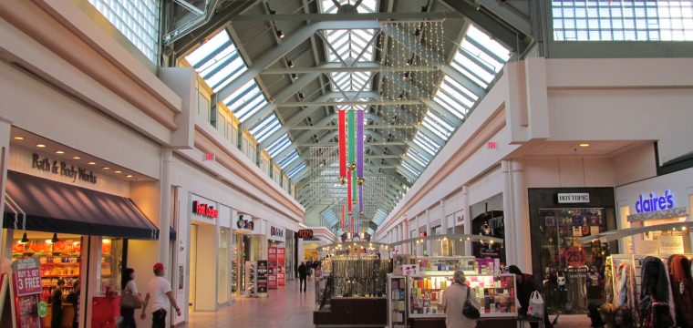
The design and outlook of your retail space influence your customer’s experience and shopping behavior. Creating the optimal space requires a combination of interior design and architectural skill. You do not need a degree in the two fields to improve your customer’s experience and boost sales. You can implement the same design tips that large retailers use and get the same results in sales. The top design tips for retail spaces are outlined below.
1. Choose an Attractive Design
The design of your store should be attractive and outstanding right from the entrance to the checkout counter. Pick the right colors and lighting that will make your store stand out. Buyers should be attracted to your store from several blocks across the road. Work with a competent interior designer to help you pick the right colors. Do not ignore the shelves or displays. The right color contrast will attract buyers to certain displays.
2. Consider the Traffic Flow in Your Store
If you study the movements of buyers on your security tapes, you can determine the right places to display some items. Studies show that shoppers tend to move in a clockwise pattern in retail shops. However, you must do an internal study to determine the pattern of your buyers. You can direct buyers to certain displays by placing strategic signs and items on their path. Your displays should attract buyers to certain products on sale and entice them to explore all the aisles.
3. Avoid Congestion Along the Aisles
Studies show that buyers tend to move on along the aisle whenever someone bumps into them, even before picking an item. You may do a good job in enticing buyers to visit certain displays, but fail to make enough sales if the store is congested. Use your space creatively to ensure that buyers can select items without bumping into each other. If you are working with small space, hire a celebrity architect like Peter Marino to help you maximize it and give your clients the best experience.
4. Create Focal Points and Speed Bumps
Buyers can easily navigate several aisles without picking any item if nothing attracts their attention. Create focal points on displays and along the aisle to entice buyers to stop and pick some items on each aisle. You can place related or complementary products near the items on focal points. Speed bumps slow down buyers along aisles, which enables them to see the variety of items on the shelves.
5. Use the Decompression Zone and Check Out Points Well
Buyers tend to miss the items near the store’s entrance or the decompression zone. Avoid placing many items here. Instead, maximize in the displays inside the store. The check out points are good places to display impulse buy items. Many buyers tend to pick a few more items at the counter. The items should be simple, easy to pick, and inexpensive.
Conclusion
You can give your buyers a great shopping experience and boost your sales by changing the outlook of your retail store. The idea is keeping the buyers inside the store longer and entice them to pick more items than they had planned. It is advisable to work with an expert designer to create the optimal retail store. However, you must do your homework and study the traffic in your store. Each retail space requires a unique design and outlook, depending on the traffic patterns.

Leave a Reply
You must be logged in to post a comment.